Fashion & Architecture: Why the Background for Your Photos is SO Important

They say that travel is the most inspiring thing you do in your life and I would have to agree! I just got back from a whirlwind trip to London with Virgin Atlantic and even in the span of our short trip I have seen so much and consequently learned a great deal as well. The architecture and design in London were amazing, from historic buildings to new construction and everything in between. It probably helped that I was also traveling with impressive lifestyle bloggers Joanna from jojotastic.com and Cassandra from cocokelley.com but I found myself observing and photographing buildings interiors in a way I never had before which got me thinking about Fashion & Architecture in an entirely new light.
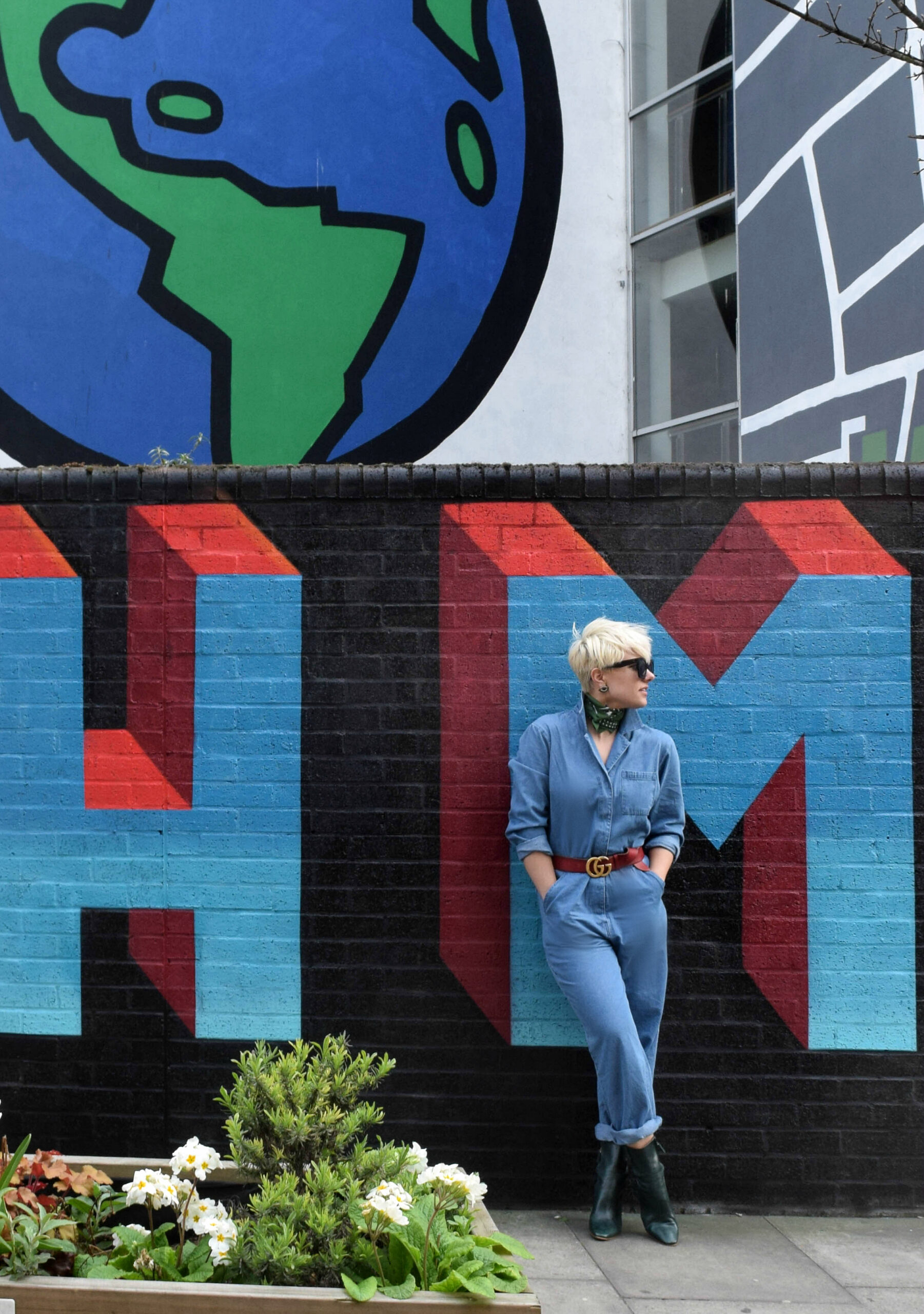
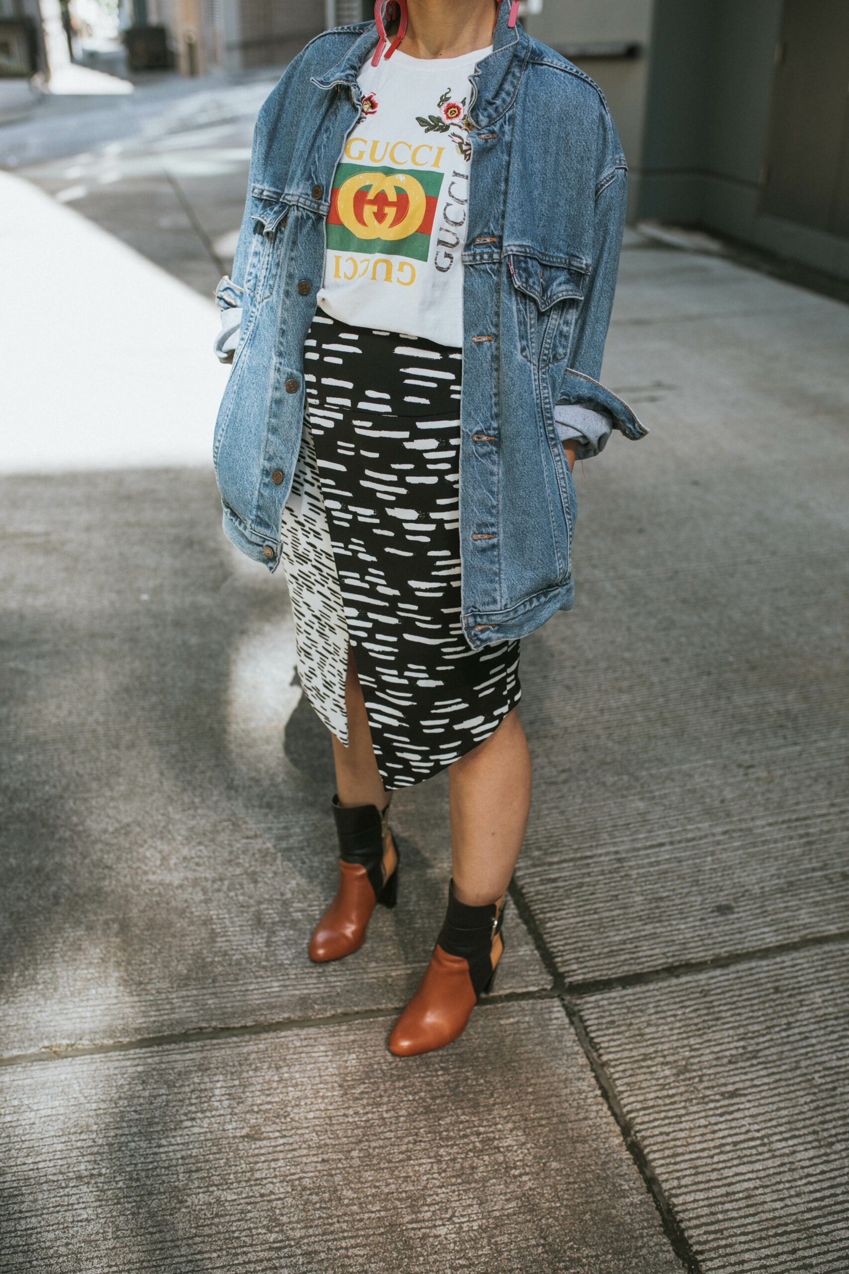
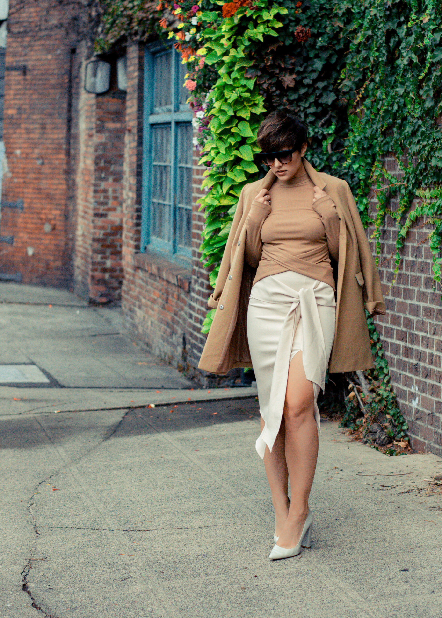
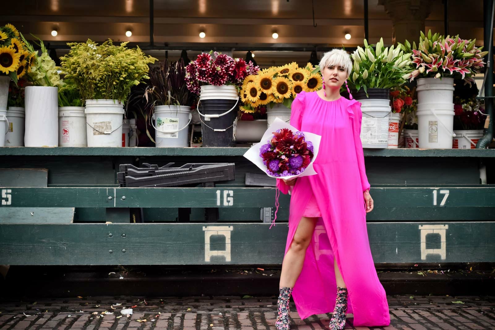
Seattle is incredibly different from London in the age of the city however there are many similarities and we too have art and architecture to appreciate as well. The intersection of Fashion & Architecture is not a new thing, they have historically gone hand in hand and as we traveled through London I was blown away by the complimentary a building or street could be to an outfit and how similarly the outfit could make part of the backdrop POP in a new way. As fashion bloggers we often search for a great ‘backdrop’ to a look, be it a busy street in New York or a lovely brick facade, but often we miss out on the artistic element that a truly unique background can bring to a look.
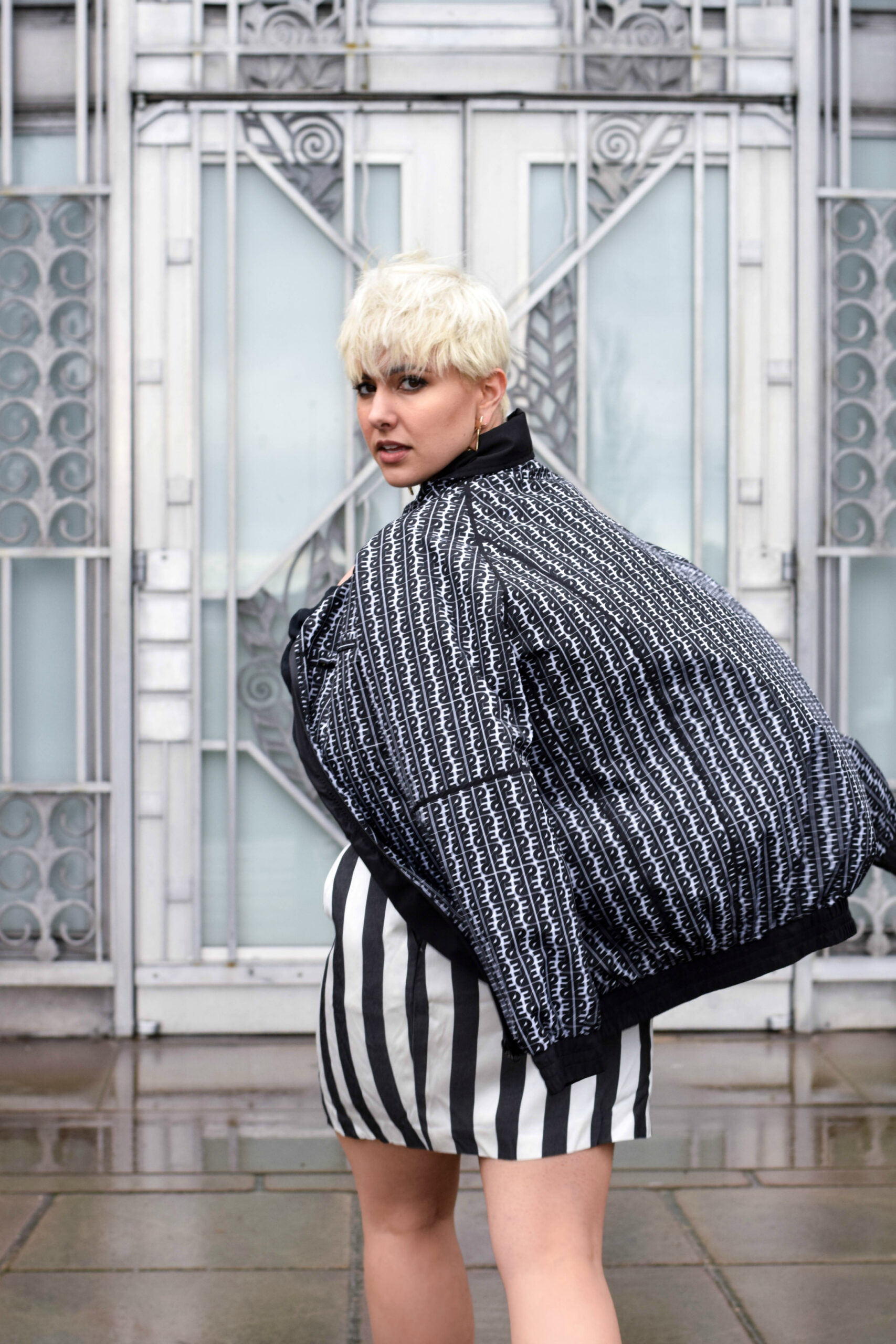
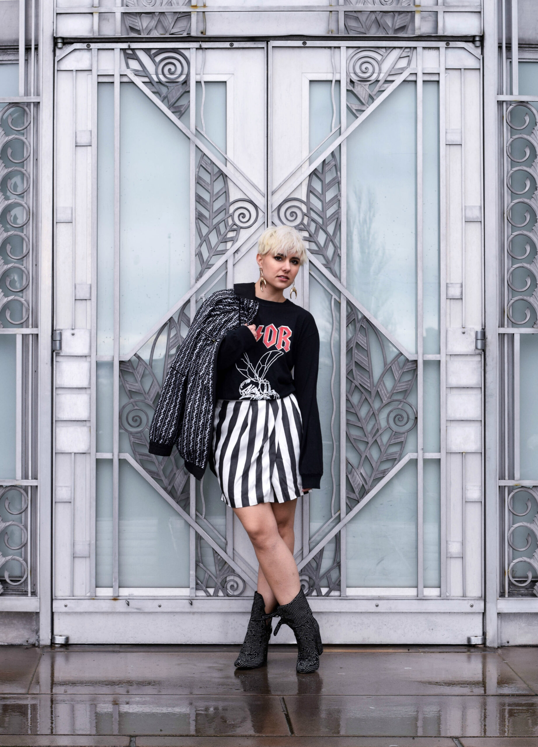
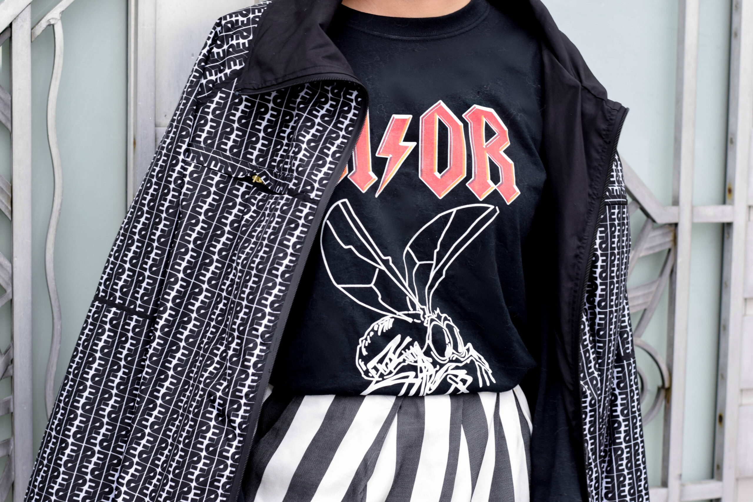
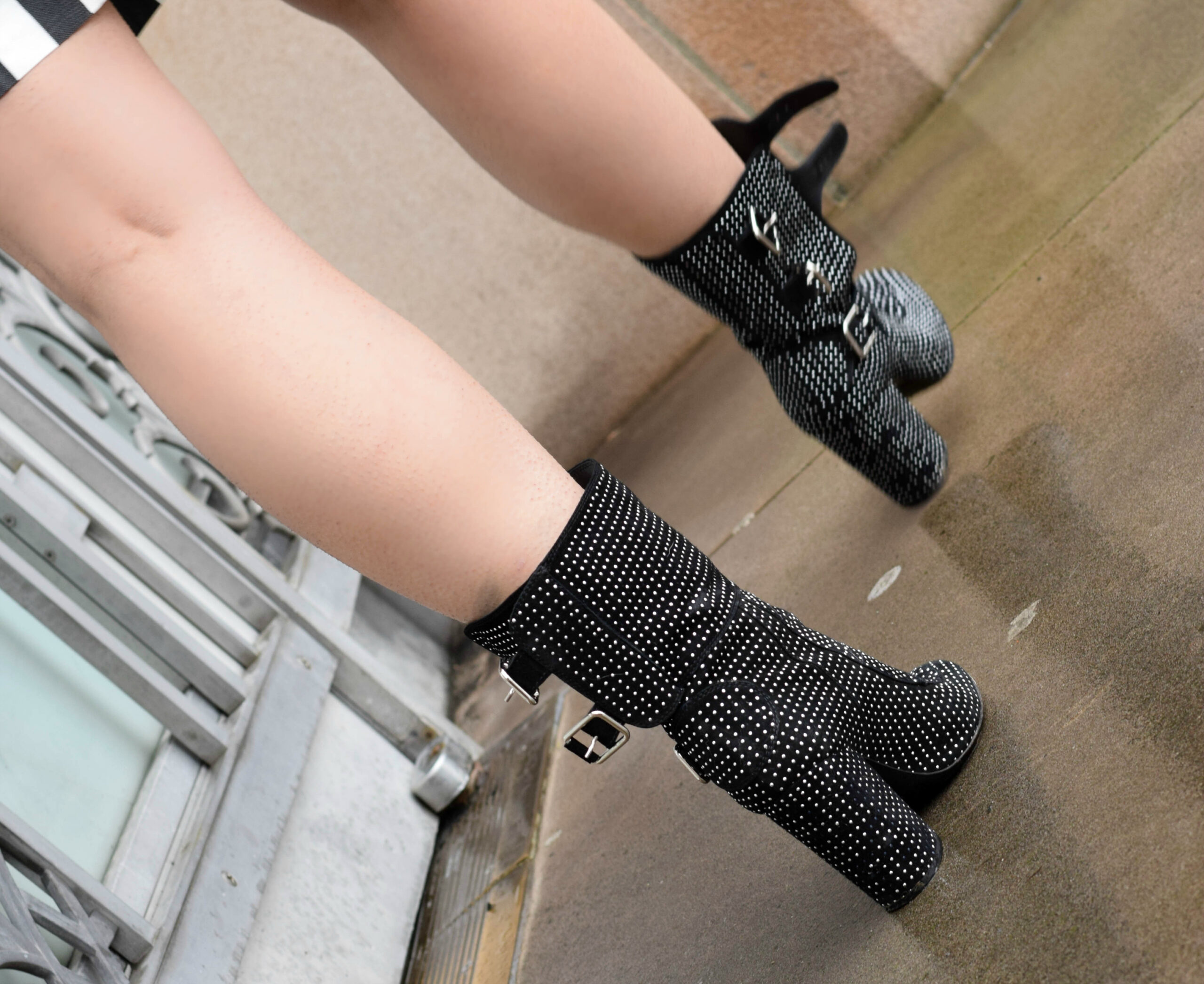
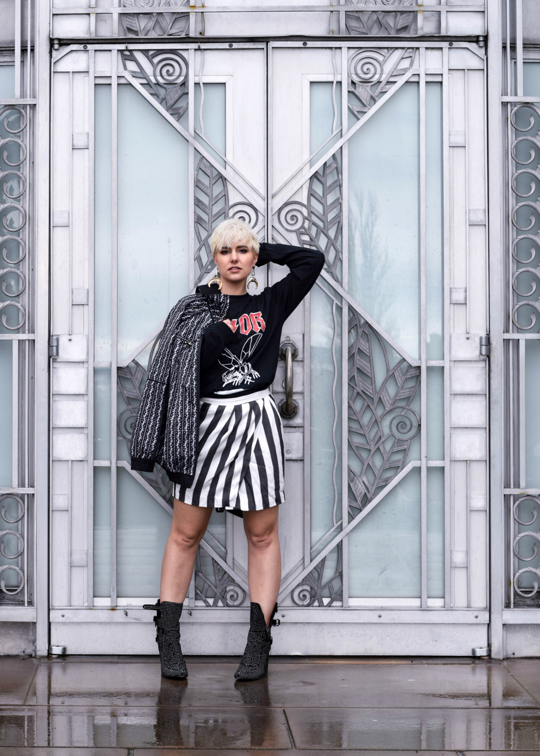
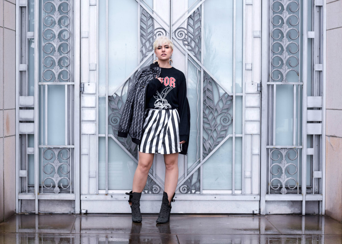
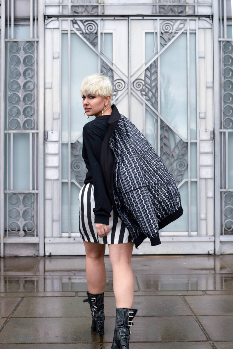
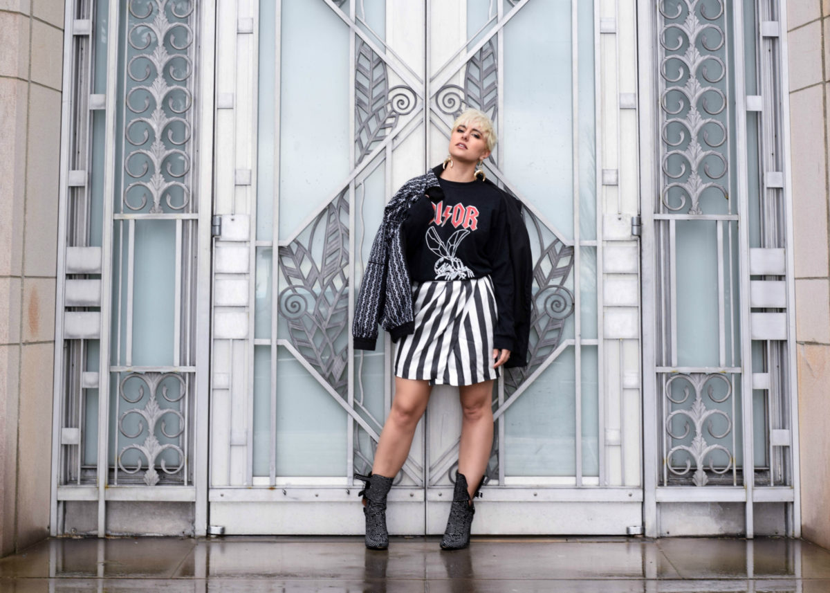
I also recently watched ‘The First Monday in May,’ the documentary about the Met Gala Costume Institute’s exhibits and as you watch the instillation being built around the clothing you realize there is an art form and power in being able to have a space that amplifies and enhances the clothing you are featuring. That is why as fashion bloggers it is important to consider architecture, use it and pay homage to it when creating our content. I have always been a more editorial focused blogger so an instillation like the doors at the Asian Art Museum were perfect for a mix printed, semi-linear look that was monochromatic. The combination of the stark black & white makes the ice blue of the Museum doors stand out while the lines and textures of the door compliment the lines and print within the outfit.
The moral here is that if the goal is to create art with our fashion on a daily basis then we need to pay attention to the other art around us to help create something greater than the sum of the parts. So ditch the concrete wall you last stood in front of and I will as well as we try together to be better at this thing called Fashion. More architecture and observations coming to blog soon so stay tuned!
Bleached Goods DIOR Tee | Zara skirt (similar HERE) | PE Nation Windbreaker (newer version HERE) | H&M Earrings | Laurence Dacade Stud Boots
Items inspired by today’s look:
